


 Venetian blinds p lay a huge role in many of the film noirs, so we wanted to make sure we included this. We chose to do this near the end bringing suspense to the big ending. The blinds create striking shadows and a closed in effect on our two characters Nancy and Martha, the blinds show them both now caught up in this and they cannot get out of it.
.jpg) For my poster I have photographs we took as a group, they work on my poster really well. I have used the photograph of Nancy and Martha as it adds mystery, leaving the viewer wondering what the women’s connection with each other is and what will happen in the story. The poster is in black and white which fits in with the film and shows the continuity. The characters are also wearing the costumes they do in the film and I feel that the way Nancy is slightly in the shadow and Martha much more in the light shows a bit about their personalities from the film.
For my poster I have photographs we took as a group, they work on my poster really well. I have used the photograph of Nancy and Martha as it adds mystery, leaving the viewer wondering what the women’s connection with each other is and what will happen in the story. The poster is in black and white which fits in with the film and shows the continuity. The characters are also wearing the costumes they do in the film and I feel that the way Nancy is slightly in the shadow and Martha much more in the light shows a bit about their personalities from the film. 

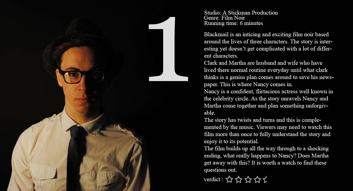
 When doing the film review, in our lesson we had looked at many in different magazines to get ideas. This really helped and also evaluating them helped decide what I would put on my own. When evaluating them in groups of two we used a HD camera to film ourselves talking through the film review. Also I wrote two of my own film reviews on Brick and LA Confidential, doing this really helped me get the idea of how to write one and what language is needed. I realised that it shouldn’t be too long and needs to be interesting. I wrote these using Microsoft word.

 We then decided that although the black and white effect looked good and worked well with our film that maybe it needed something more to it as at the moment the clips all looked a bit grey and didn't bring the depth of the colours out. We decided to add another effect to our clip to give it a darker and more interesting feel. We looked at many different effects under 'Video Filters' and then we chose one under the section 'Stylize and the filter right at the end called 'Vignette'. As you can see it gives the image a darker edge and looks better.
 We also used music and sound effects on our film to give it the final touch and finish to the film. We were happy how this made it sound like a real film and made it more interesting. We got these sounds of a website who we would email to get the permission from after making our account.
  In our film we also tried to use many different shop types. We used many including two shot and extreme close up, I have gone through the film and selected all the different shots we used shown in the photos. We also used camera tracking, panning and zooming which I couldn't show on the photos.
 As I have mentioned before Venetian blinds play a big role in film noir. As this is a major convention we wanted to make sure we included this in our film. On the left is our venetian blinds and on the right is a scene from Mildred Pierce where they have included venetian blinds. I am really happy with our shot and think they are a lot more obvious and striking compared to the more subtle ones of Mildred Pierce.
  Another convention of Film Noir is Single Source lighting. The left hand photograph is our scene where Clark is going to Nancys house, the single light source from the sun works really well and really defines the shot. I have compared this with the lighting in Brick and the light coming towards the camera from behind the character Brendan.
  Film noir films are known for being in black and white and being quite dark. The lighting is also dark and a lot of low key lighting is used. Our film is also in black and white and in the particular scene of Nancy and Clark our lighting is very low, which works well with the light from the door. I have compared this with the low key lighting used in the last scene of Double Indemnity where he is confessing his story. This is my first film review I did. The actual review on each one is the same i just wanted to play around with the background and positioning. This first one is just Clark (James Bell) I like this one as I think it is simple and as this character isn't in the film poster it creates other ideas about the film and shows more. I like where the text is and I think it doesn't look to much to read. Also the image is the main focus.
  This is my second review, again with the same text and font yet a different background. I like the background on this one as i think it shows the characters and what they are actually like in the film. Martha is looking down on Nancy and Nancy is giving all her attention to the camera. I like the positioning of the text, i think it works with the image and is an easy read. I included the one with inspiration from Empire magazine and think it works well on the page.
  This is the last film review idea that i did. The photograph is of Clark (James Bell) and Nancy (Beth Robson) and shows that Nancy seems more into Clark by staring at him and he just isn't acting interested. I think this photograph works really well as it gives what would happen in the film away but just the right amount. I have also included the same set up of text yet this time with the one behind the text and changed the opacity so it wasn't so bold on the page.
 The image on this page is of four poster ideas I did, as I was working on them i changed my mind. in the first image is the photograph of me and Jess with the title BLACKMAIL at the top of the page and then the actors names below all in the same red and font. I didn't like the title being so far away from the photograph so I moved it down shown in the next photo along with the actors names which I much preferred. I then included the text at the top of the page and made this in a smaller grey font. This font is saying the production company and age rating. I like this text at the top as doesn't leave the poster plain and empty but gives it more. I also added in the age rating of 15 at the bottom right hand corner in a circle. It is not really visible in this image as it kind of blends in with the background. So in the final image I made it in white and the circle around in red but changed the opacity so they didn't deffer the eye from the poster. I also changed the opacity from the text as the top as I felt it wasn't that important. I have included my final poster at the bottom of this page. I think it is eye catching and the photograph on it works really well, the red gives it a more interesting twist and suggests danger from the two women. I tried to capture the layout of real film posters by looking at some and getting ideas.
  I also wasnt sure which effect i liked on my photograph. I opened the photo in photo shop first and changed the curves and brightness and contrast to give the photograph a deeper feel and colours stronger. I then made it into blac and white and really like how it turned out. I then looked under filters and decided i liked the filter 'Film Grain' as it gave the photograph a sort of old fashioned feel but in the end it didnt actually work in the poster so i took it off and the poster looked clearer.

 20th century fox is also an American film production company. It is one of the major companies and was founded in 1935. The image used by the company is very bold and powerful and really shows how they see themselves as a big contender in the business.20th Century Fox also produced many film noirs, including Laura and Fallen Angel. This is helpful as they are similar to what we are making and have huge experience across many films.
  We wanted this to flash up at the beginning and then go onto who was starring in our film. As a group we decided in the end that this looked to boring for the start of our film so we wanted to change it, we had a few ideas and decided that instead of having it on the computer we would write out the production company name and film us doing this. We wrote out the name on black card with white tipex to get the effect we wanted and then uploaded the clip onto the Mac computers and made the speed faster.
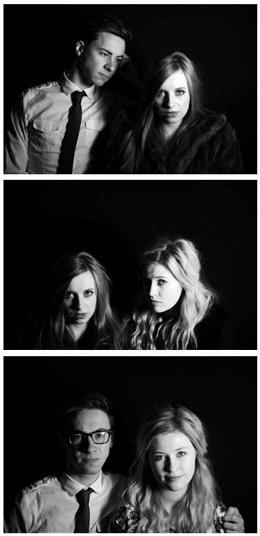
 The photos to the left are of our three characters in our film, we didn't use anyone that wasn't in our group for actors as using other people would be harder to arrange and would be a longer process. We also printed off sheets for the character profile and for each seperate character filled one out. Below I have included some of the questions:
  PROPS
PROPS COSTUMES
 This next set of costumes is for Nancy. We again selected these carefully deciding what Nancy would wear. The first outfit is the black dress on the left. This dress was shown in the very first scene where Clark and Nancy where at the premier together, with this outfit we wanted to show Nancy as a celebrity hence why we chose a long black dress with sequins and sparkle. I feel this costume does work but I think that we could have got a more flattering and glamorous costume to fit Nancy's personality. The next costume is the blue dress and jacket, we chose this outfit for Nancy to wear in the day and it is shown in the scene were Clark visits Nancy's house. This outfit works quite well as it fits in with the times but is maybe something more that Martha would have worn even though it is quite smart so suits Nancy in that way but isn't hugely glamorous. The grey dress was another option for Nancy to wear in the day, we filmed her wearing it in a scene in the office with Clark but in the end decided that just her in the fur coat would work and you wouldn't actually be able to see the grey dress, also the colour is a bit dull. I think the fur coat works well and is quite glamorous for Nancy.
 This photograph shows Clarks costume. We kept it simple with Clark, in film noirs that we had watched the male always wore a suit and maybe a hat. We took this and decided that clark would also wear a suit and hat. He wore a grey trouser suit with thin tie and a white shirt. He also had a grey hat to match the suit and black framed glasses. In some scenes Clark isn't wearing his hat or has his glasses tucked into his pocket. this adds a different edge to his costume and makes him looked relaxed. Overall we wanted Clark to look smart and ready for work which fit in the time era.
 As a group we then decided on using our houses and various places around school. Using our houses as locations was easier as the times we could use them worked better whereas using some areas in school was difficult with noise and lessons taking place in the rooms we wanted.
 The next image is also for Clark and Marthas house. We used this setting in the scene were Clark is running down the stairs and then Martha follows behind. This staircase works really well as we were able to film up the stairs at a low angle if we needed to, giving real height to the shot and the turn of the steps at the tops leave the viewer intrigued more. We could also film from the left of the stairs near the banister as it was the right level with the camera on a tripod. In the end we shot the scene from just to the left of the stairs so we could catch the actors running down the stairs and then past the camera. We also wanted to make sure that the character was visable and not far away that you couldnt see who they were. This location worked really well and was in the same house as the kitchen shown above so was easy enough to shoot both scenes and get them done on the same day, also with the same lighting and bringing it together to actually give the characters a home and kind of back story.
  The next location we needed to find was Nancys house where we needed a scene from the outside, a living room scene and then a scene by the front door. In the end we chose a house and it worked quite well. The first image here is the front door which we used, the door looks effective as it is tall and wooden with crosses on the window showing the hidden element to Nancy Hartley and maybe her and Clarks relationship. We also wanted to use the hallway leading up to this front door in a scene. The lead up to the door works quite well, it leads the viewer out of the living room where another scene was filmed to out the door. the staircase down the right side adds depth to the what would be a plain long corridor. I would have preffered if the radiator was not in the shot but it does not take really any attention away from the characters. We then used the living room in the same house, we needed to make sure it was in the same location as in the scene at one point Martha is by the window looking in. The room worked well we only wanted to include Nancy and Clark sitting on the sofa together so we tried to not include the TV or any modern applicances. We also needed shots outside of Nancys house as part of the storyline so we used the same house so we could use the front door. From the outside the house looked good and worked effectively it stands tall and imposes over the characters. We needed a long shot so we could include Clark and Martha walking separately towards the house. The oval around the door way also worked well giving more shape to the door and shadowing Clark from anyone seeing him even better.


