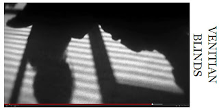
 Venetian blinds p lay a huge role in many of the film noirs, so we wanted to make sure we included this. We chose to do this near the end bringing suspense to the big ending. The blinds create striking shadows and a closed in effect on our two characters Nancy and Martha, the blinds show them both now caught up in this and they cannot get out of it.
 When it comes to costumes film noir is set in the 1940’s to 50’s so we wanted to take this into consideration. They would wear structured blazers, long skirts, shirts for the women and suit and hat for the men. We really tried to use this convention and have used costumes which as a group we felt would match our characters and the time period. One main costume that was used was fur coats for the women, this shows glamour and elegance with a touch of power from the women.
We have challenged the conventions of our film noir as many are American and set in built up urban streets. We have stuck with the English accent as we didn’t want it to look fake and we wanted to show a different side to a film noir. Also are locations are rarely anywhere but the office and the houses yet in some there is the built up housing area so this shows the film noir conventions. All three of the products we were asked to make all link together well, the film then the film poster and then after the film is seen comes the film review.
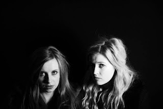.jpg) For my poster I have photographs we took as a group, they work on my poster really well. I have used the photograph of Nancy and Martha as it adds mystery, leaving the viewer wondering what the women’s connection with each other is and what will happen in the story. The poster is in black and white which fits in with the film and shows the continuity. The characters are also wearing the costumes they do in the film and I feel that the way Nancy is slightly in the shadow and Martha much more in the light shows a bit about their personalities from the film.
For my poster I have photographs we took as a group, they work on my poster really well. I have used the photograph of Nancy and Martha as it adds mystery, leaving the viewer wondering what the women’s connection with each other is and what will happen in the story. The poster is in black and white which fits in with the film and shows the continuity. The characters are also wearing the costumes they do in the film and I feel that the way Nancy is slightly in the shadow and Martha much more in the light shows a bit about their personalities from the film. 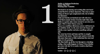
All of my products link together effectively, I had the same ideas running through and made sure I kept this throughout. I am really happy with how they turned out and overall I think my poster and film work the best together. The poster is simple but still reflects the characters in the film and I think is quite eye catching.
What have you learnt from your audience feedback?
On Thursday the 22nd of March we had a screening of our films at school. We had an issue with the laptop being jumpy and making the film really dark but it was still watched. Also we hadn’t finalised our whole film so it didn’t have the finishing touches on it. The media department gave everyone who came to watch post-it notes to write there feedback on.
We also wrote our own feedback on the other group’s films. It was actually really helpful to watch the other groups and write feedback on there’s. It gave us something to think about and made us think whether we could make the same improvements to ours or what we liked best or thought they could do better.
I think that working on a film for this long began to be hard to see that it was something good. We had spent a lot of time filming and changing things around and trying to work out what would actually work with time restrictions. Also when the only three characters in the film are acted by the members in the group it is very easy to be extremely critical and not like our performances. So when this feedback came back to us a few days later we were really happy, we looked at the comments and thought about what they had said also took it on board.
I have learnt that every individual picks out different bits of the film and notice different things to what maybe you had noticed before. We had a few comments on our venetian blind shot which we were all incredibly pleased with. I think it brings the film noir elements in. it was a shame that the laptop was effecting our film as it could have looked better than it actually did and that affected our feedback.
I also asked a family member to discuss my film for me to give me some insight to what a different age range thought and whether it would appeal to them. I did this to gather a range of comments.
How did you use new media technologies in the construction and research, planning and evaluation stages?
The first research stage of our topic was actually watching the film noirs in class; we watched them on the screen of video as they are quite old. Watching these films really helped ideas for our own film and to actually get to grips with film noir. Also I used the internet to do my own research for film noir; I looked at websites of presentations and also went on YouTube to look at trailers for film noirs. This really helped me to gain an insight of the history and popular films.
We all sat down at the computer and wrote our screen play together, we used Microsoft word to do this. We used a simple black font and then did locations props and costumes in red. We put a key at the top telling what each colour meant and highlighted the appropriate areas. This helped make the screen play clear to understand and really helped when filming.
When we had written this we also did our character profiles. We wanted to decide what the characters were really like before acting as them. We used character profile sheets to decide and then went on to film our interviews. We used a HD camera for the filming and set it in the studio using the studio lights. This worked well; we then downloaded them onto the Apple Mac computers. We did this so we could add all the different clips together using Final Cut Express. This was simple as the clips were good as they were so there wasn’t much editing involved.
When deciding on our costumes for our film we used from the Drama department at our school, we did this because when we were looking in there we had found many different costumes that fit into this era. We also made sure that the costumes suited our characters.
As our planning for our production, I looked up a few different which I have included on my blog. I looked at their logos and they were very striking and bold. As a group we sat down and put in different ideas for the production company name and the final decision was ‘A Stickman Production’. We decided this would go at the beginning of our film and we simply wrote the title. This didn’t look very exciting at all, it was plain and simple but didn’t have an eye catching effect. So we decided to change it and we decided that we would have one of our group write it on black paper in white and we filmed it on the camera. We then downloaded and put it onto the Mac computer; we downloaded it into final cut express and put it on the beginning of our film. We added an affect to make it be unwritten which looks much more interesting than the original.
For our film we filmed with a HD camera and most of the time we used a tripod. We used the tripod for our filming so that we got a clear effect and the camera had no shake to it. This actually worked really well and made it easier for us to pan and using tracking with the camera. We used all natural lighting for our film, and got some single source lighting from the sun which is a convention of film noir. We filmed a lot of separate clips for our film and then downloaded them on to the Apple Mac computers. We did this by using the log and transfer key. It was easier having separate clips as we could decide what needed to be cut out of them and what we would use.
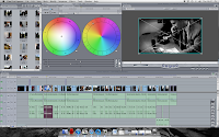
The editing process was done on the Mac computers using Final Cut Express. As a group we sat together and decided every element we would include.
The editing process was done on the Mac computers using Final Cut Express. As a group we sat together and decided every element we would include.
 When doing the film review, in our lesson we had looked at many in different magazines to get ideas. This really helped and also evaluating them helped decide what I would put on my own. When evaluating them in groups of two we used a HD camera to film ourselves talking through the film review. Also I wrote two of my own film reviews on Brick and LA Confidential, doing this really helped me get the idea of how to write one and what language is needed. I realised that it shouldn’t be too long and needs to be interesting. I wrote these using Microsoft word.
 Next I took photographs with my group for the film review. I had the idea that I wanted the image across the whole page and the text on top of it. I wanted the photograph to be the main focus. We used a Nikon camera to take these photos in the studio with a single source light and used a soft box on it. I then downloaded the images and decided what ones I wanted to use using windows photo viewer. When I had decided I opened the photos in Adobe Photo Shop CS5, I am familiar using this programme so it was quite simple what I was doing. I added curves to the photo to give the colours more depth, I then added the film review using the text tool and made it white on the black background. I think it looks really effective and isn’t too long that it would bore the reader.


No comments:
Post a Comment