In our lesson we analysed different film reviews to get ideas for our own. I have included this video above.
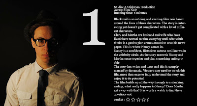
 This is my first film review I did. The actual review on each one is the same i just wanted to play around with the background and positioning. This first one is just Clark (James Bell) I like this one as I think it is simple and as this character isn't in the film poster it creates other ideas about the film and shows more. I like where the text is and I think it doesn't look to much to read. Also the image is the main focus.
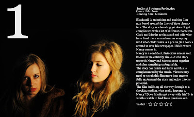
  This is my second review, again with the same text and font yet a different background. I like the background on this one as i think it shows the characters and what they are actually like in the film. Martha is looking down on Nancy and Nancy is giving all her attention to the camera. I like the positioning of the text, i think it works with the image and is an easy read. I included the one with inspiration from Empire magazine and think it works well on the page.
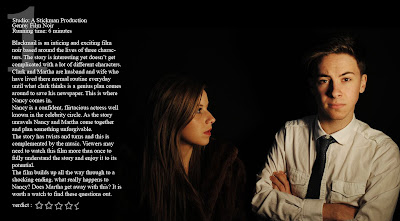
  This is the last film review idea that i did. The photograph is of Clark (James Bell) and Nancy (Beth Robson) and shows that Nancy seems more into Clark by staring at him and he just isn't acting interested. I think this photograph works really well as it gives what would happen in the film away but just the right amount. I have also included the same set up of text yet this time with the one behind the text and changed the opacity so it wasn't so bold on the page.
No comments:
Post a Comment