As said on the previous post we came together to take the photographs. The next section was alone, I have spoken previously about ideas for my poster and decided what kind of thing I wanted, we then took the photographs and I decided against. I have used Adobe Photo Shop CS5 to create my poster.

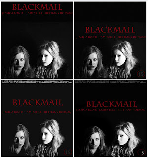
The image on this page is of four poster ideas I did, as I was working on them i changed my mind. in the first image is the photograph of me and Jess with the title BLACKMAIL at the top of the page and then the actors names below all in the same red and font. I didn't like the title being so far away from the photograph so I moved it down shown in the next photo along with the actors names
which I much preferred. I then included the text at the top of the page and made this in a smaller grey font. This font is saying the production company and age rating. I like this text at the top as doesn't leave the poster plain and empty but gives it more. I also added in the age rating of 15 at the bottom right hand corner in a circle. It is not really visible in this image as it kind of blends in with the background. So in the final image I made it in white and the circle around in red but changed the opacity so they didn't deffer the eye from the poster. I also changed the opacity from the text as the top as I felt it wasn't that important. I have included my final poster at the bottom of this page. I think it is eye catching and the photograph on it works really well, the red gives it a more interesting twist and suggests danger from the two women. I tried to capture the layout of real film posters by looking at some and getting ideas.

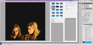
I also wasnt sure which effect i liked on my photograph. I opened the photo in photo shop first and changed the curves and brightness and contrast to give the photograph a deeper feel and colours stronger. I then made it into blac and white and really like how it turned out. I then looked under filters and decided i liked the filter 'Film Grain' as it gave the photograph a sort of old fashioned feel but in the end it didnt actually work in the poster so i took it off and the poster looked clearer.
 The image on this page is of four poster ideas I did, as I was working on them i changed my mind. in the first image is the photograph of me and Jess with the title BLACKMAIL at the top of the page and then the actors names below all in the same red and font. I didn't like the title being so far away from the photograph so I moved it down shown in the next photo along with the actors names which I much preferred. I then included the text at the top of the page and made this in a smaller grey font. This font is saying the production company and age rating. I like this text at the top as doesn't leave the poster plain and empty but gives it more. I also added in the age rating of 15 at the bottom right hand corner in a circle. It is not really visible in this image as it kind of blends in with the background. So in the final image I made it in white and the circle around in red but changed the opacity so they didn't deffer the eye from the poster. I also changed the opacity from the text as the top as I felt it wasn't that important. I have included my final poster at the bottom of this page. I think it is eye catching and the photograph on it works really well, the red gives it a more interesting twist and suggests danger from the two women. I tried to capture the layout of real film posters by looking at some and getting ideas.
  I also wasnt sure which effect i liked on my photograph. I opened the photo in photo shop first and changed the curves and brightness and contrast to give the photograph a deeper feel and colours stronger. I then made it into blac and white and really like how it turned out. I then looked under filters and decided i liked the filter 'Film Grain' as it gave the photograph a sort of old fashioned feel but in the end it didnt actually work in the poster so i took it off and the poster looked clearer.
No comments:
Post a Comment