The next stage after our filming process was to edit our film, once we had filmed everything we began to do this. We used a small HD camera to film which we then plugged into the Apple Mac computers to download our clips. We simply selected the clips which we wanted to use and moved them into Final cut express using the Log and Transfer button.
We would then sit and edit our film all together around the one computer, we would watch it then crop down bits we didn't like and add effects we all thought would work.
The main effect which we used on our whole film was black and white. We decided to make it black and white as we wanted to include that element of a classic film noir, we had also chosen the time period of around the 1950s which black and white works well with. We managed to create this effect by (as shown in the image) selecting 'Effects' then to 'Video Filters' to 'Colour Correction' and then finally to 'Colour Corrector'. This was easy to do and then you would select 'Colour Corrector' on the left hand clip.
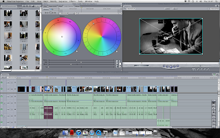
This would then take you to a screen like the next image. The screen has the two colour wheels and then the whites, mids, blacks and saturation sections below it. These sections were easy to change and all was needed was moving the cursor along to the effect you wanted it at, this would show on the opposite screen so that it was easier for us all to decide. We then moved the cursor on the 'Saturation' section down to the end on every clip to get the black and white effect which we were aiming for originally. We were happy with how this turned out.
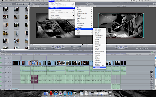
We then decided that although the black and white effect looked good and worked well with our film that maybe it needed something more to it as at the moment the clips all looked a bit grey and didn't bring the depth of the colours out. We decided to add another effect to our clip to give it a darker and more interesting feel. We looked at many different effects under 'Video Filters' and then we chose one under the section 'Stylize and the filter right at the end called 'Vignette'. As you can see it gives the image a darker edge and looks better.
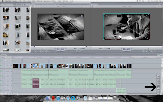
We also cropped a lot of our clips down. When we uploaded the clips to the computer some bits were good and some bad so we would cut the bad out, also if we felt the section of the clip was unnecessary and was taking up to much of the 5 minutes then we would cut it out. We cut our clips by using then cut tool on final cut express this is found on the toolbar on the right hand side where I have put the arrow and you simply select that then select the section of the clip you want to cut and select delete.
We also used music and sound effects on our film to give it the final touch and finish to the film. We were happy how this made it sound like a real film and made it more interesting. We got these sounds of a website who we would email to get the permission from after making our account.

In our film we also tried to use many different shop types. We used many including two shot and extreme close up, I have gone through the film and selected all the different shots we used shown in the photos. We also used camera tracking, panning and zooming which I couldn't show on the photos.
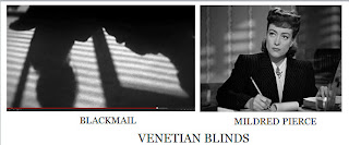
As I have mentioned before Venetian blinds play a big role in film noir. As this is a major convention we wanted to make sure we included this in our film. On the left is our venetian blinds and on the right is a scene from Mildred Pierce where they have included venetian blinds. I am really happy with our shot and think they are a lot more obvious and striking compared to the more subtle ones of Mildred Pierce.
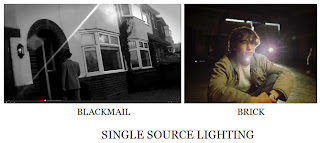
Another convention of Film Noir is Single Source lighting. The left hand photograph is our scene where Clark is going to Nancys house, the single light source from the sun works really well and really defines the shot. I have compared this with the lighting in Brick and the light coming towards the camera from behind the character Brendan.
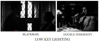
Film noir films are known for being in black and white and being quite dark. The lighting is also dark and a lot of low key lighting is used. Our film is also in black and white and in the particular scene of Nancy and Clark our lighting is very low, which works well with the light from the door. I have compared this with the low key lighting used in the last scene of Double Indemnity where he is confessing his story.


 Venetian blinds p lay a huge role in many of the film noirs, so we wanted to make sure we included this. We chose to do this near the end bringing suspense to the big ending. The blinds create striking shadows and a closed in effect on our two characters Nancy and Martha, the blinds show them both now caught up in this and they cannot get out of it.
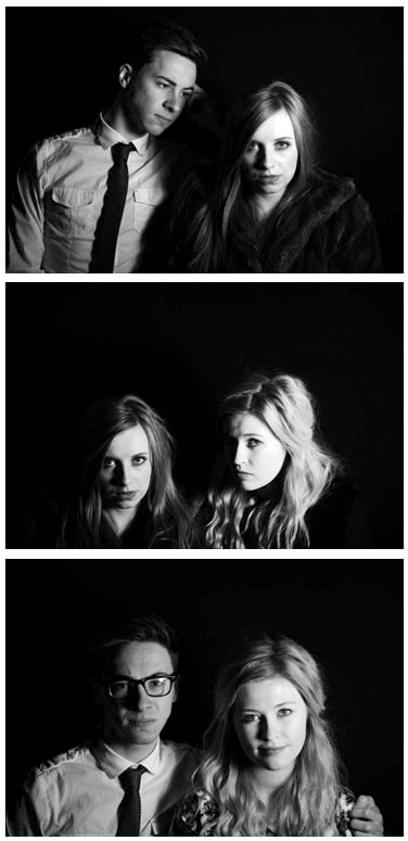
.jpg) For my poster I have photographs we took as a group, they work on my poster really well. I have used the photograph of Nancy and Martha as it adds mystery, leaving the viewer wondering what the women’s connection with each other is and what will happen in the story. The poster is in black and white which fits in with the film and shows the continuity. The characters are also wearing the costumes they do in the film and I feel that the way Nancy is slightly in the shadow and Martha much more in the light shows a bit about their personalities from the film.
For my poster I have photographs we took as a group, they work on my poster really well. I have used the photograph of Nancy and Martha as it adds mystery, leaving the viewer wondering what the women’s connection with each other is and what will happen in the story. The poster is in black and white which fits in with the film and shows the continuity. The characters are also wearing the costumes they do in the film and I feel that the way Nancy is slightly in the shadow and Martha much more in the light shows a bit about their personalities from the film. 


 We then decided that although the black and white effect looked good and worked well with our film that maybe it needed something more to it as at the moment the clips all looked a bit grey and didn't bring the depth of the colours out. We decided to add another effect to our clip to give it a darker and more interesting feel. We looked at many different effects under 'Video Filters' and then we chose one under the section 'Stylize and the filter right at the end called 'Vignette'. As you can see it gives the image a darker edge and looks better.
 We also used music and sound effects on our film to give it the final touch and finish to the film. We were happy how this made it sound like a real film and made it more interesting. We got these sounds of a website who we would email to get the permission from after making our account.
  In our film we also tried to use many different shop types. We used many including two shot and extreme close up, I have gone through the film and selected all the different shots we used shown in the photos. We also used camera tracking, panning and zooming which I couldn't show on the photos.
 As I have mentioned before Venetian blinds play a big role in film noir. As this is a major convention we wanted to make sure we included this in our film. On the left is our venetian blinds and on the right is a scene from Mildred Pierce where they have included venetian blinds. I am really happy with our shot and think they are a lot more obvious and striking compared to the more subtle ones of Mildred Pierce.
  Another convention of Film Noir is Single Source lighting. The left hand photograph is our scene where Clark is going to Nancys house, the single light source from the sun works really well and really defines the shot. I have compared this with the lighting in Brick and the light coming towards the camera from behind the character Brendan.
  Film noir films are known for being in black and white and being quite dark. The lighting is also dark and a lot of low key lighting is used. Our film is also in black and white and in the particular scene of Nancy and Clark our lighting is very low, which works well with the light from the door. I have compared this with the low key lighting used in the last scene of Double Indemnity where he is confessing his story.
  This is my second review, again with the same text and font yet a different background. I like the background on this one as i think it shows the characters and what they are actually like in the film. Martha is looking down on Nancy and Nancy is giving all her attention to the camera. I like the positioning of the text, i think it works with the image and is an easy read. I included the one with inspiration from Empire magazine and think it works well on the page.
  This is the last film review idea that i did. The photograph is of Clark (James Bell) and Nancy (Beth Robson) and shows that Nancy seems more into Clark by staring at him and he just isn't acting interested. I think this photograph works really well as it gives what would happen in the film away but just the right amount. I have also included the same set up of text yet this time with the one behind the text and changed the opacity so it wasn't so bold on the page.
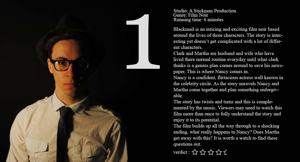
 The image on this page is of four poster ideas I did, as I was working on them i changed my mind. in the first image is the photograph of me and Jess with the title BLACKMAIL at the top of the page and then the actors names below all in the same red and font. I didn't like the title being so far away from the photograph so I moved it down shown in the next photo along with the actors names which I much preferred. I then included the text at the top of the page and made this in a smaller grey font. This font is saying the production company and age rating. I like this text at the top as doesn't leave the poster plain and empty but gives it more. I also added in the age rating of 15 at the bottom right hand corner in a circle. It is not really visible in this image as it kind of blends in with the background. So in the final image I made it in white and the circle around in red but changed the opacity so they didn't deffer the eye from the poster. I also changed the opacity from the text as the top as I felt it wasn't that important. I have included my final poster at the bottom of this page. I think it is eye catching and the photograph on it works really well, the red gives it a more interesting twist and suggests danger from the two women. I tried to capture the layout of real film posters by looking at some and getting ideas.
  I also wasnt sure which effect i liked on my photograph. I opened the photo in photo shop first and changed the curves and brightness and contrast to give the photograph a deeper feel and colours stronger. I then made it into blac and white and really like how it turned out. I then looked under filters and decided i liked the filter 'Film Grain' as it gave the photograph a sort of old fashioned feel but in the end it didnt actually work in the poster so i took it off and the poster looked clearer.